
The ability to mix colors and create a new and unique palette? *Chef’s kiss* I believe it’s one of the most exciting aspects to painting—with watercolors, oils, or acrylics.
It may seem intimidating at first, but once you start, you’ll see that it opens a whole new world of possibilities and creativity.
Before you start mixing your paints and creating new colors… here are a few important details:
- Write a record of the paint names and amounts used
- Experiment (and label) with the ratio of paints used
- Use scrap paper to swatch the colors (and label them!)
- Always have a clean cup of water before mixing paints
- Keep your mixing paints separate from any other paint on your palette
From one artist who’s dealt with the consequences of her actions, please take these notes into consideration before you start mixing paints 😅
Here is the order of steps in mixing your paints:
Order Of Steps
1. Start with small & equal amounts of paint.
Watercolor painting is essentially coloring the water, so you need a small drop on your palette. Write the amounts and paint names on your paper and make sure there’s good separation between the two colors—you don’t want an accidental mix happening as you’re moving your brush on the palette.
2. Use a clean brush and clean water.
Always start with a clean, damp brush and a clean and clear cup of water. This ensures that your colors remain pure and don’t get muddied by leftover paint.
3. Mix the paints and water slowly.
Gradually combine the colors, adding a little at a time—the water will dilute the color, so it’s best to start with a 2:1 ratio of water to paint. You can always go darker (or have a more saturated color), but it’s difficult to get lighter (or less saturated) on your palette so take it easy and go slow.
4. Test your color swatch.
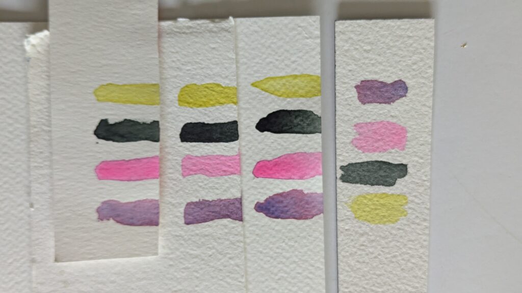
Before applying the mixed color to your painting, test it on a scrap piece of watercolor paper. This is when I advocate for cheaper watercolor paper—using that as a testing pad allows you to keep your “nice” paper for your masterpieces.
However… paints and colors apply and look different from paper manufacturer to manufacturer. In Watercolor Foundations, I demonstrate this concept with four different paints on three differently weighted papers from three different manufacturers. Here’s a quick snapshot of the demonstration:
Watercolor Foundations is a 6-module class that eliminates the guesswork of watercolor painting. It’s a deep dive into the equipment, tools, techniques, and process—because I believe that if you understand why and how, you’ll throw away less paper and start framing your own work in your house. Join Watercolor Foundations here >>
5. Record Your Mixes.
Always, always, always write down your recipe—the name of the paint, the manufacturer of the paint, and the amount of paint and water used. This will help you replicate the same color in future projects.
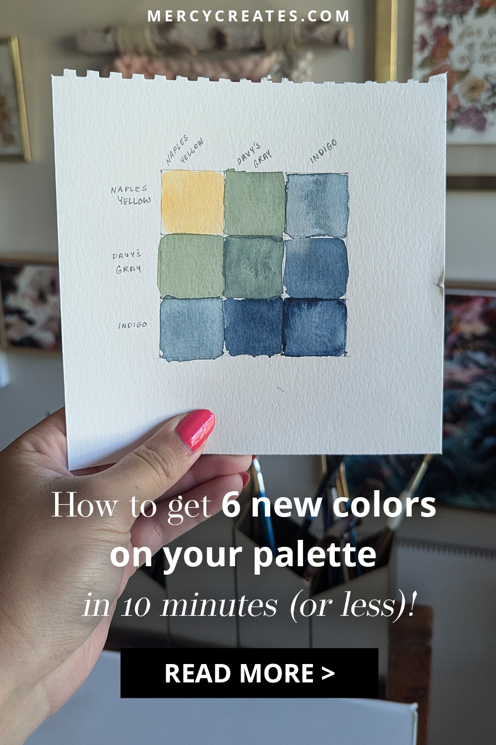
Watch me create 6 new colors with 3 paints
In this demonstration, I’m using Perylyn Green, Indigo, and Naples Yellow to create a color chart. A color chart is an easy and organized way to record your color mixtures.
The color chart has 50-50 mixtures of each paint and a 100% mixture of the original paint. Here is a list of the paints used to create this color chart:
Perylyn Green, Indigo, and Naples Yellow are three of the five paints used in the “Ocean Storm” color scheme for 2025 Palette of the Month, so this color chart is just a snapshot of the possibilities 🤩
Palette of the Month is a monthly subscription that enables you to paint with predetermined coordinating colors. The paints can be used cohesively in one project or individually in whatever you create. It’s a mini appetizer to the world of colors, and you can join Palette of the Month here.
In defense of purchase *less* paint:
Mixing paints is more than just a fun experiment—it’s a smart way to stretch your supplies and budget.
By learning to blend your own colors, you can save money and make the most of the paints you already own. Instead of buying a wide range of pre-mixed tubes, you can invest in a few basic colors and create an infinite variety of shades from them (because in these demonstrations, we’ve only used a 50/50 ratio of paints… think of all the new colors you can create with a 25/75 or 10/90 ratio!).
But the benefits don’t stop with your happy bank account… 😏Mixing colors “level up’s” your artistry. You not only gain a deeper understanding of color theory but you also craft unique, personalized shades that separates your art from others. Color mixing is an exercise in creativity and precision that gives you control over your palette and helps you express your vision more authentically.
If you’re excited about mixing colors and want that sampling to jumpstart your creativity, join Palette of the Month here. You’ll receive five different shades that not only create one coordinating painting… but can also create (minimum) twenty new colors when you mix them together. It’s a “taste test” of color and manufacturers, so you spend less and paint more. Start color mixing and creating with Palette of the Month here.
We’ve got the painting sketched out and the color palette ready, so now it’s time to start putting paint to paper! This blog showcases my favorite watercolor techniques for painting florals, and you can read it here.


")


